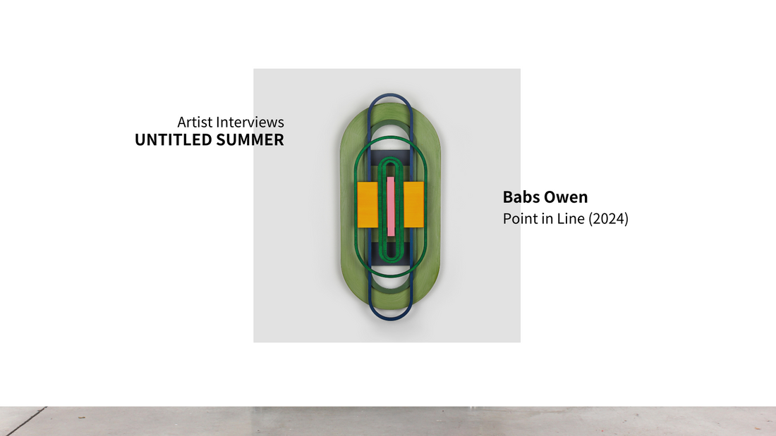
Can you discuss any significant influences—artists, movements, or personal experiences—that have shaped your artistic style?
I am deeply influenced by the psychological power of color and how it can enhance one's state of being. I am looking for that experience when I am in my studio making something. Warm colors give me energy and excitement, while cool colors give a sense of calmness and contentment. I certainly felt that as a seven-year-old playing around with food colors and white napkins. I was recently reminded of this project when asked if I remembered the first time I felt the sensory impact of color.
At the time our kit came with the primary colors: red, yellow, and blue, plus green. By dripping a color on to a wet white paper napkin, it spread to make a shape and later merged with other colors I added creating vibrant and colorful squares. I made dozens and would leave them to dry on our old cast-iron
steam radiators in our house in Maine. Once dry, the accordion-shaped radiator coils left my napkins with a unique ridged texture, adding an unexpected but exciting tactile dimension. I think that this early attraction to the combination of a physical shape with color has formed me as an artist.
Influences are multiple from Blinky Palermo to Guy Goodwin, Anni and Joseph Albers to Sonja Delaney, Anne Truitt to Arlene Shechet to Malevich to ....
What inspired the specific artworks you have chosen for UNTITLED SUMMER? Or can you briefly describe or introduce your artwork that is exhibiting at Chelsea Walls?
I am showing four wooden oblong-shaped paintings called 'Portals”. There are made up of fragmented parts that are put together into a design. An initial shape -in this case an oblong - gets outlined or contoured until it is too small to exist. They draw inspiration from art history (Sonia Delaunay, Joseph Albers, Jasper Johns, Judy Chicago) and serve as experiments in lyrical uses of color, and color dynamics, particularly within the context of feminist art. I use the terms “portals”, “targets”, “or “vaginas” interchangeably.
Embarking on the series in 2021-22, I've encountered various challenges. (I started making these out of wood after several years of using painted paper I would cut with an Xacto.) Some pieces came to life as I had imagined, while others required time and thought. Initially, I set out to achieve a smooth paint application, aiming to minimize visible brushstrokes. However, as the series progressed, I consciously
decided to reveal my hand as a painter, incorporating texture and exploring the complex interplay between perfection and imperfection.
Essentially these pieces are very new and this show is their debut!
What emotions or messages do you hope to convey through your artwork? Are there particular themes or concepts that you explore in your work?
As I said, color plays a significant role, and I hope they operate as ideas and/or symbols (Warm colors giving excitement, vs cool colors give a sense of calm.) I want to represent the subject by capturing the meanings (inherent or imposed). They really began as ideas that combine the inner and outer worlds (reality and imagination). If you look back at earlier shapes, they started off more window or screen like – I actually called them “windows” and then one day the shape changed and they looked more vaginal.
So, for me the shape & form comes first and color second. Finding the shape, I then position them within the impact of color on perception, drawing influence from color theorists such as Joseph Albers, Emily Noyes Vanderpoel, and Johann Wolfgang von Goethe. This exploration of color, guided by the investigations of Albers and Vanderpoel, involves maintain a journal to record my optical responses and preferences. Moreover, Goethe's idea that color is embodied within individuals and evokes philosophical concepts has significantly shaped my work, prompting viewers to delve into a philosophical exploration of color.
Aside from being influenced by color theory and finding a shape to work those theories out on emotion connected to colors is important in the developing of my current work. I think that is fundamental. One way I am doing this is to incorporate writing about the memories of certain colors and think about them when I make a piece. It has become a way to dig into my past and work with a memory in the present. But people looking at my work would not know that the blue I use references a memory from falling into a lake when I was two. The only memory I have (other than the story being told to me of that event) is of falling into water and opening my eyes to a vast aqua-ish blue. Thankfully I was pulled out and wasn’t physically altered by the experience but the visual memory of my body suspended in blue has altered me.
If you asked me what is my favorite color is, I would say blue – the whole family of blues! A particular favorite is Phthalo Blue, straight out of the tube. I can’t get enough of it.

